This project was part of a partnership with the United Nations Development Programme. They recently released a large scale study looking at income inequality in sub-Saharan Africa and were looking for ways to make the content, which mainly consisted of statistical analyses, more engaging to non-economists. The study itself features many recommendations for how countries can invest in order to improve inequality, but often these suggestions are messy. For example, many interventions shown as beneficial to relieving poverty actually ended up exacerbating inequality.
While reading the study, I was really taken with the chapter on agricultural productivity (chapter 4) and the vast potential to help the populations suffering most from income inequality and poverty. For example, for many countries in sub-Saharan Africa, up to 60-70 percent of labour is employed in agriculture, yet it generates only 25-30 percent of GDP so investment in agricultural productivity can drastically improve the lives of many.
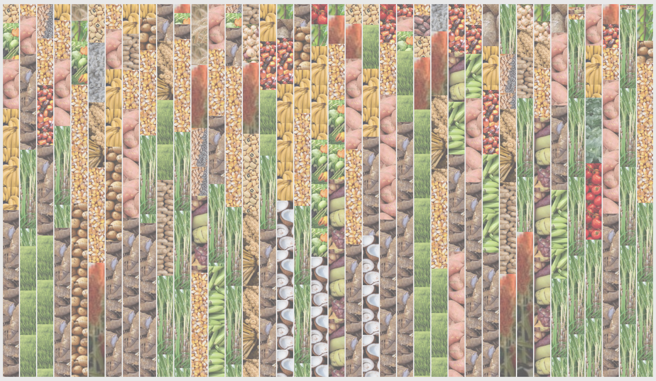
I wanted to create a tool to give users a chance to engage with the way agricultural productivity relates to income inequality in these countries, but realized that I myself had no idea what this looked like -- I had all the metrics I could possibly want, but wanted a way to make this topic more immediate and tangible, both to myself and to the user. That is when I got the idea to represent each country in sub-Saharan Africa by the crops most representative of their agricultural system -- a sort of agricultural country DNA.
Once I had established this visual language, I then used it to illustrate the relation between a country's agricultural profile to other key human development indicators through a scrolling narrative approach. As users progress through the piece, the bars visually transform to make way for the data ultimately ending in a exploratory playground allowing for on the fly interaction.


